Client
BATTLEFRONT MALTA
Timeline
2 WEEKS
Category
Cultural Experience

Visual Identity Refresh
CHALLENGE
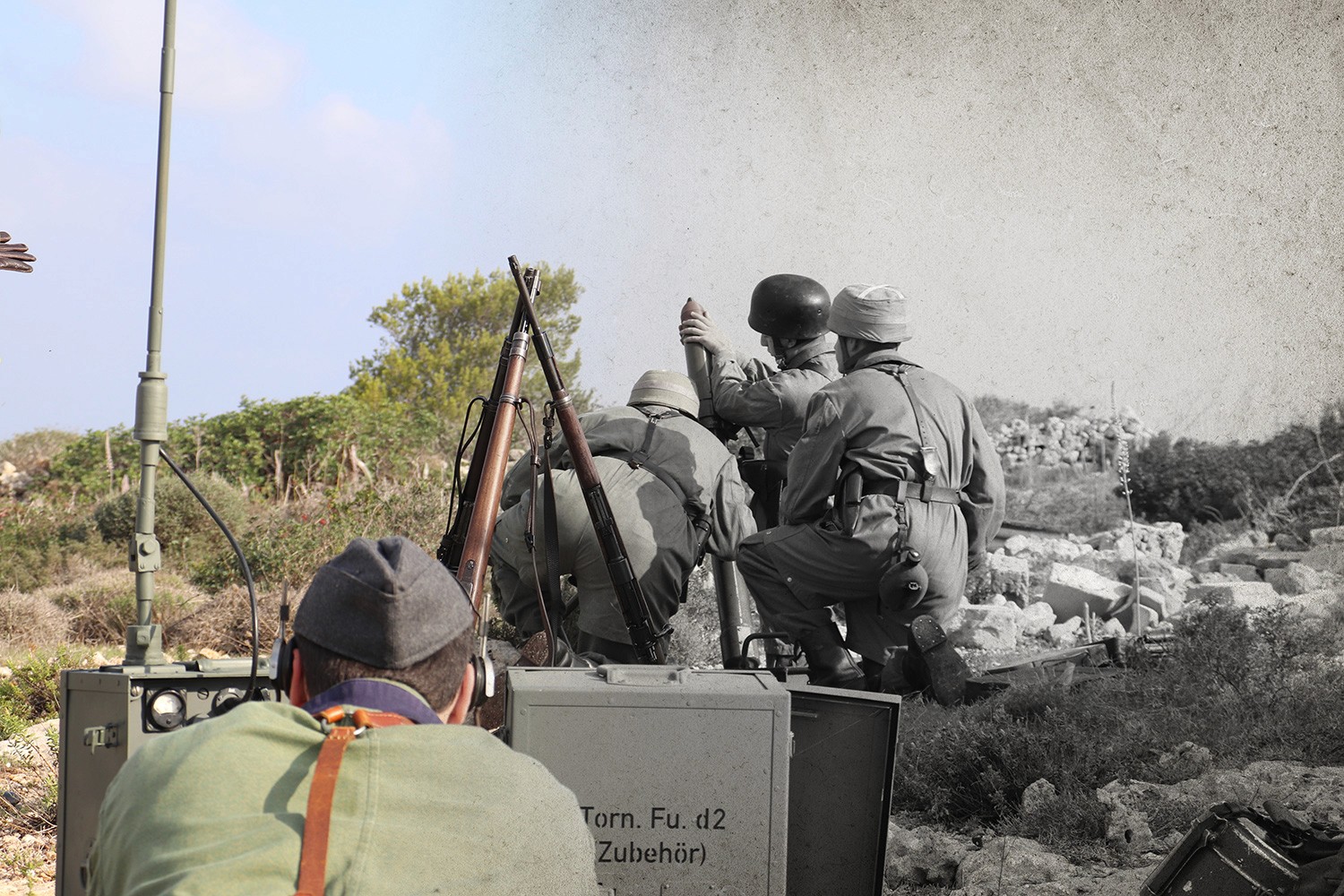
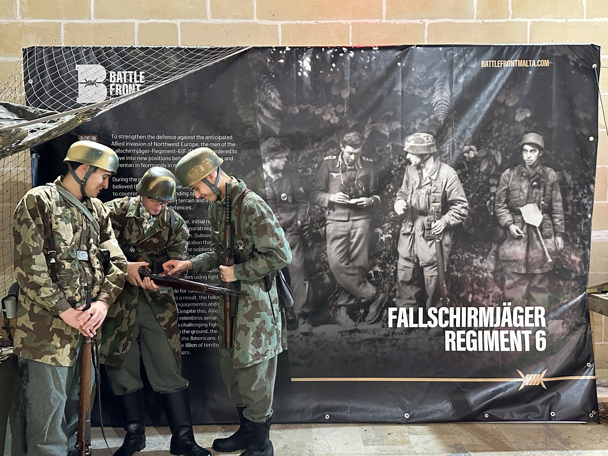
Battlefront aims to capture the essence of military history through its new brand aesthetic. By revitalizing the logo and overall design, the brand seeks to evoke a sense of authenticity and fascination associated with historical military campaigns. The rebranding effort aims to establish a strong and enduring connection with enthusiasts, collectors, researchers, and those passionate about military history, while expanding its appeal beyond its existing fan base.


SOLUTION
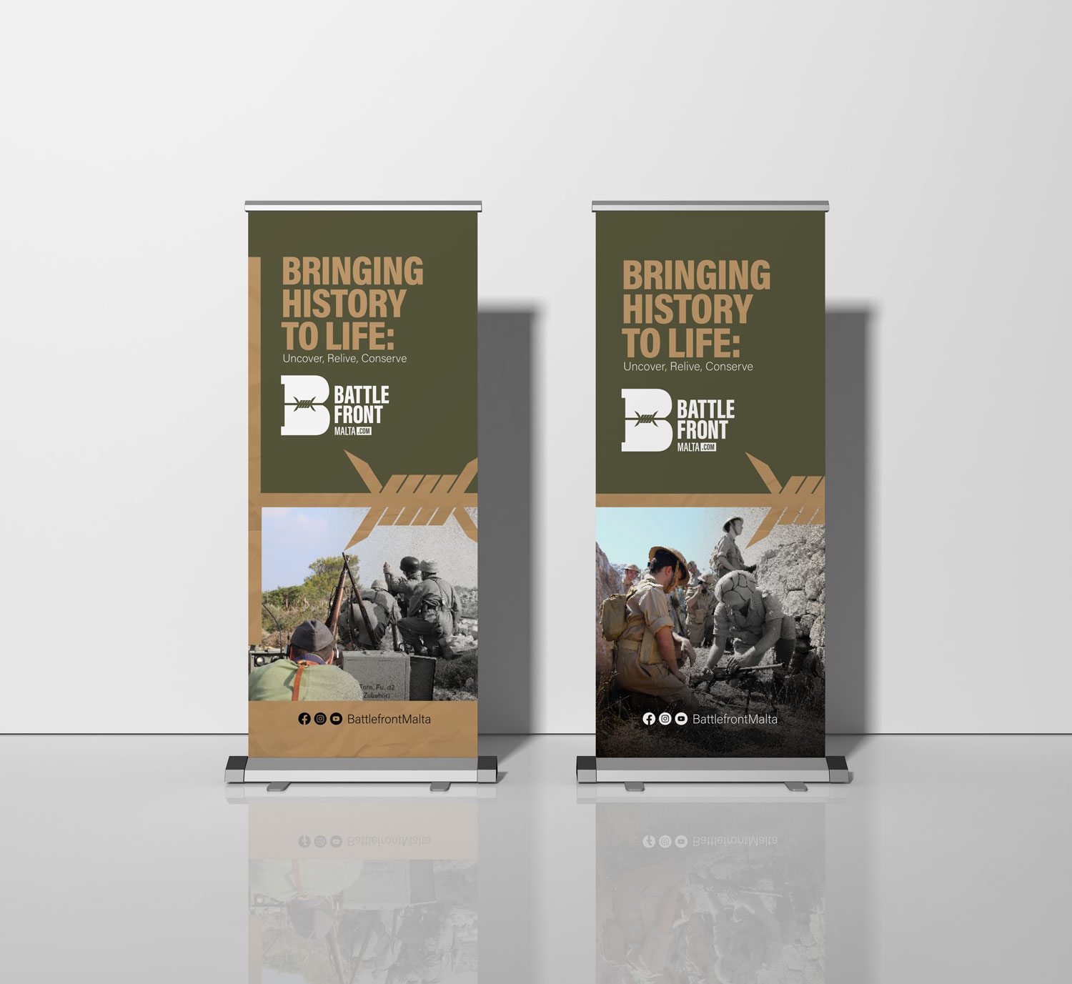
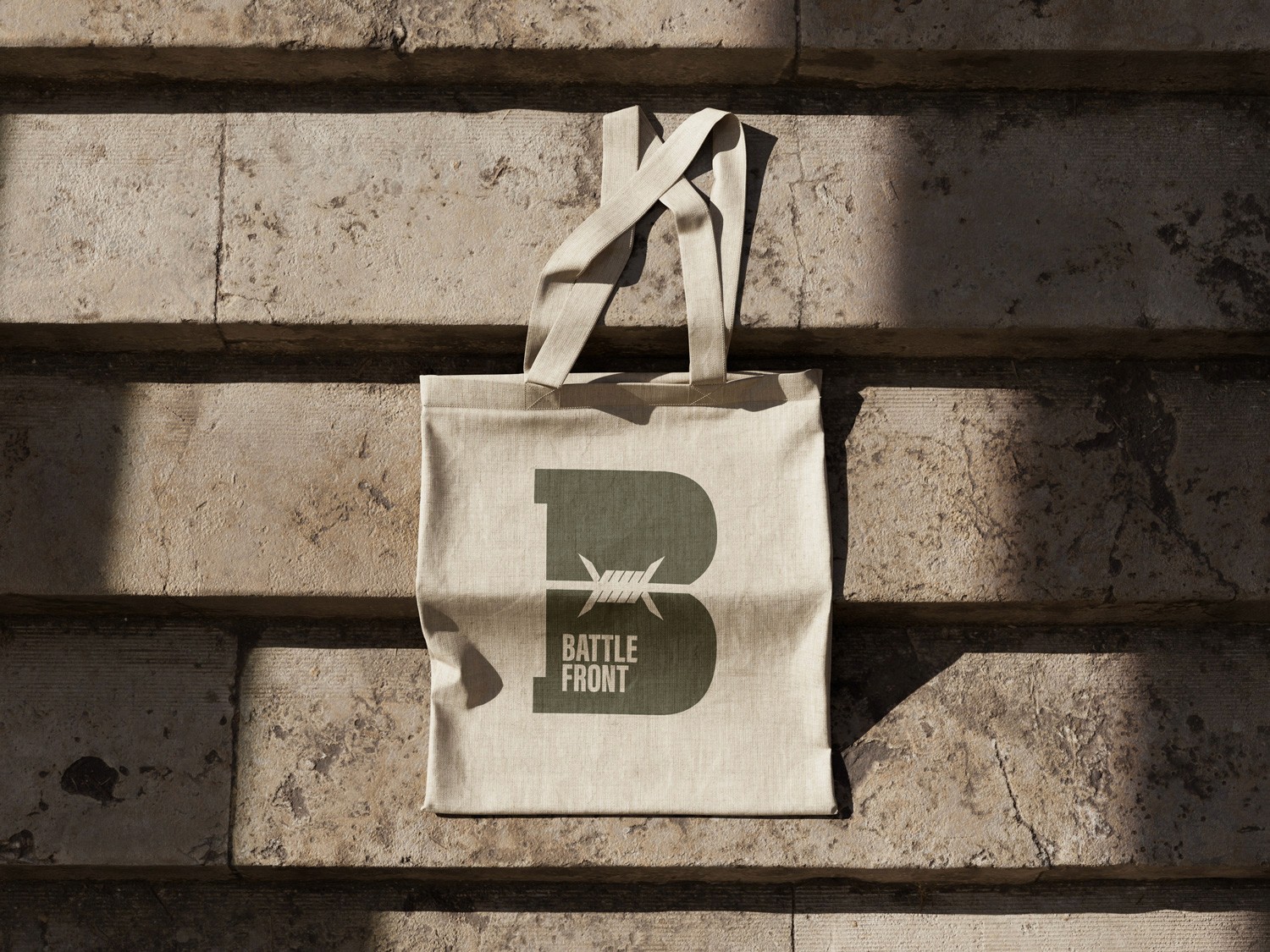
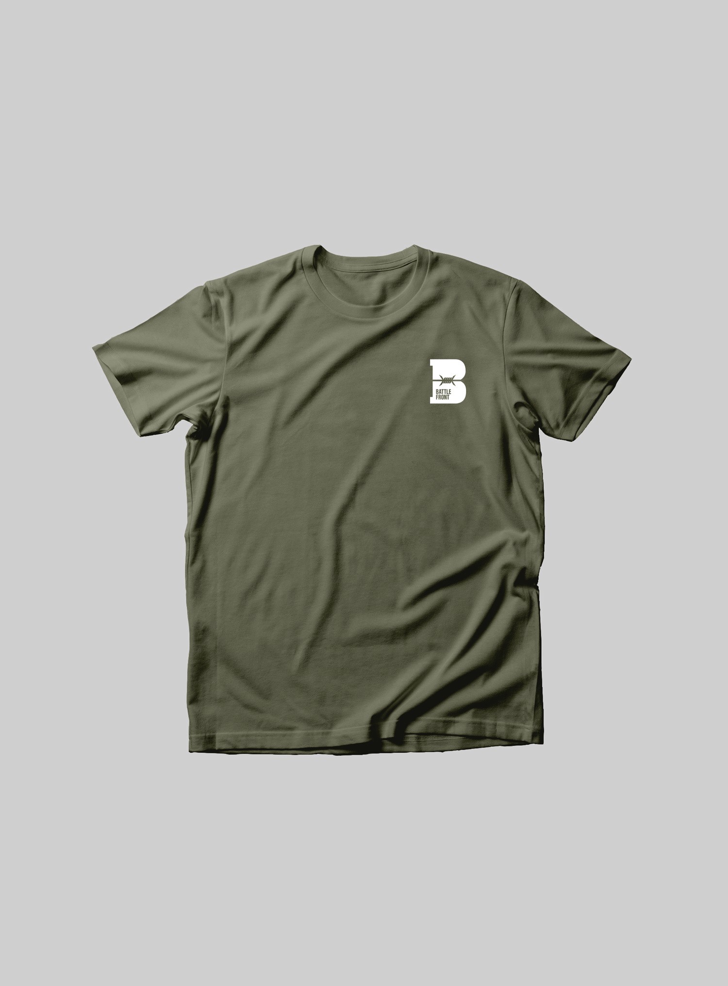
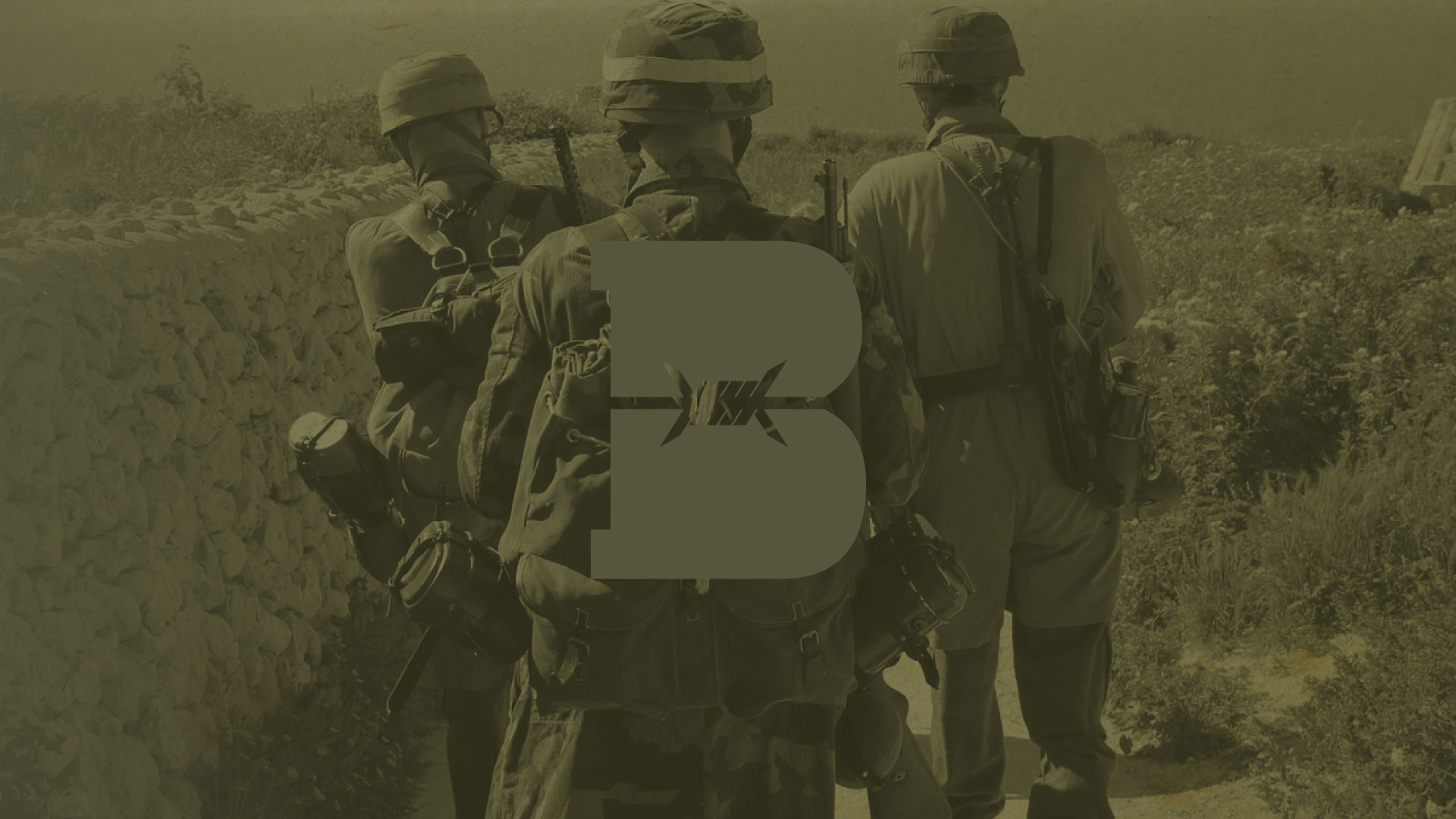
The strategy behind this logo concept is to modernize the brand through a simple yet meaningful design that retains a connection to the current identity. By integrating a barbed wire silhouette into the shape of the letter B, the logo becomes both visually distinctive and symbolically rich. The barbed wire reinforces key brand values—strength, resilience, and the hardships of battle—while enhancing the recognizability and impact of the mark.
RESULT
The result is a cohesive and impactful brand identity that not only modernizes Battlefront’s visual presence but also strengthens its emotional connection with audiences. The distinct logo—featuring the barbed wire-integrated “B”—has proven highly recognizable, helping the brand stand out in a crowded market. This renewed clarity and consistency across touchpoints has increased brand recall, attracted a broader audience of history enthusiasts, and contributed to a measurable uptick in website engagement and sign-ups from both longtime fans and new users.