Our starting point for all design work is research and understanding the clients objectives. A fresher colour palette and look and feel allowed the brand to thrive without loosing the overarching foundations of the brand.
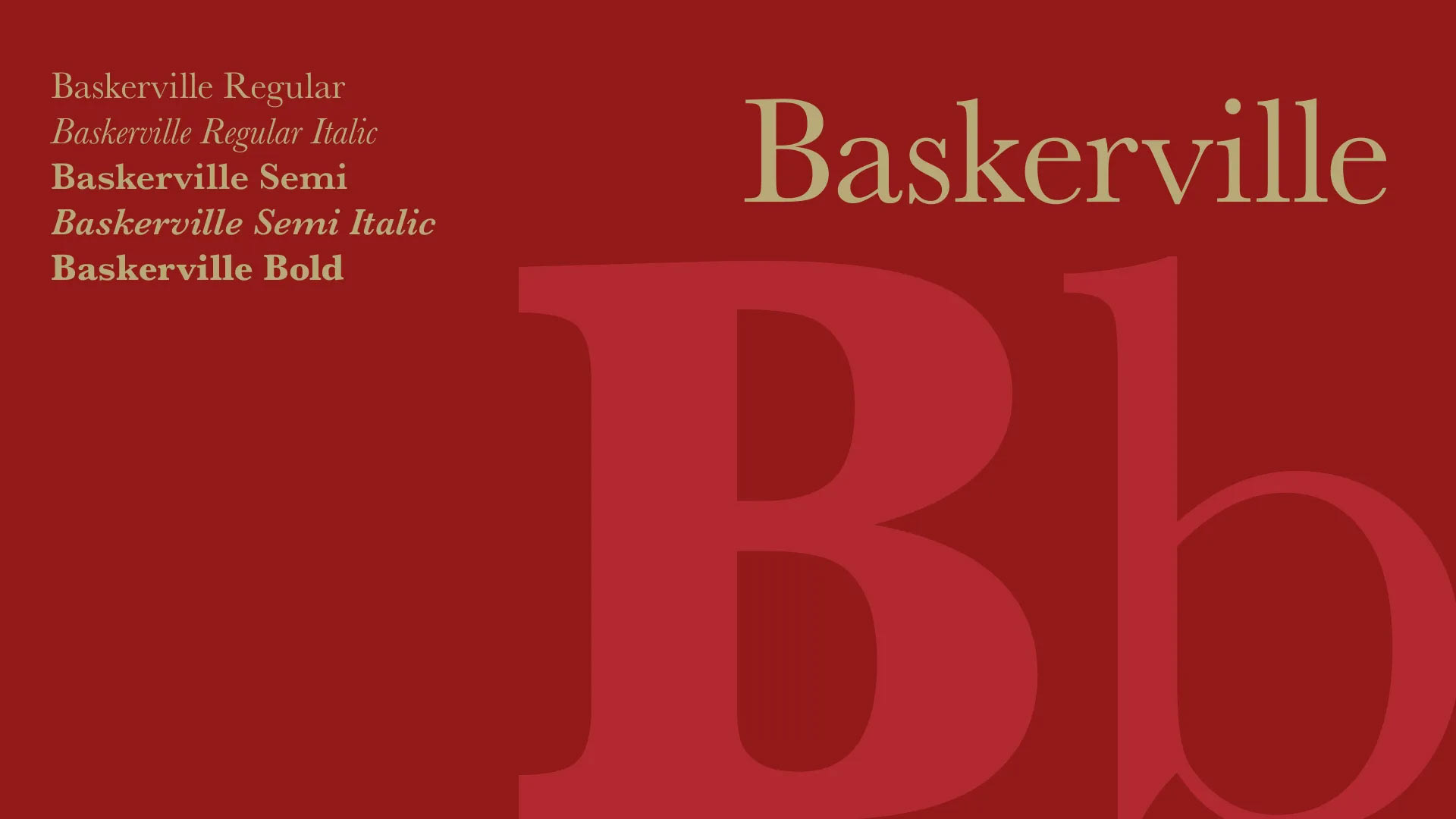
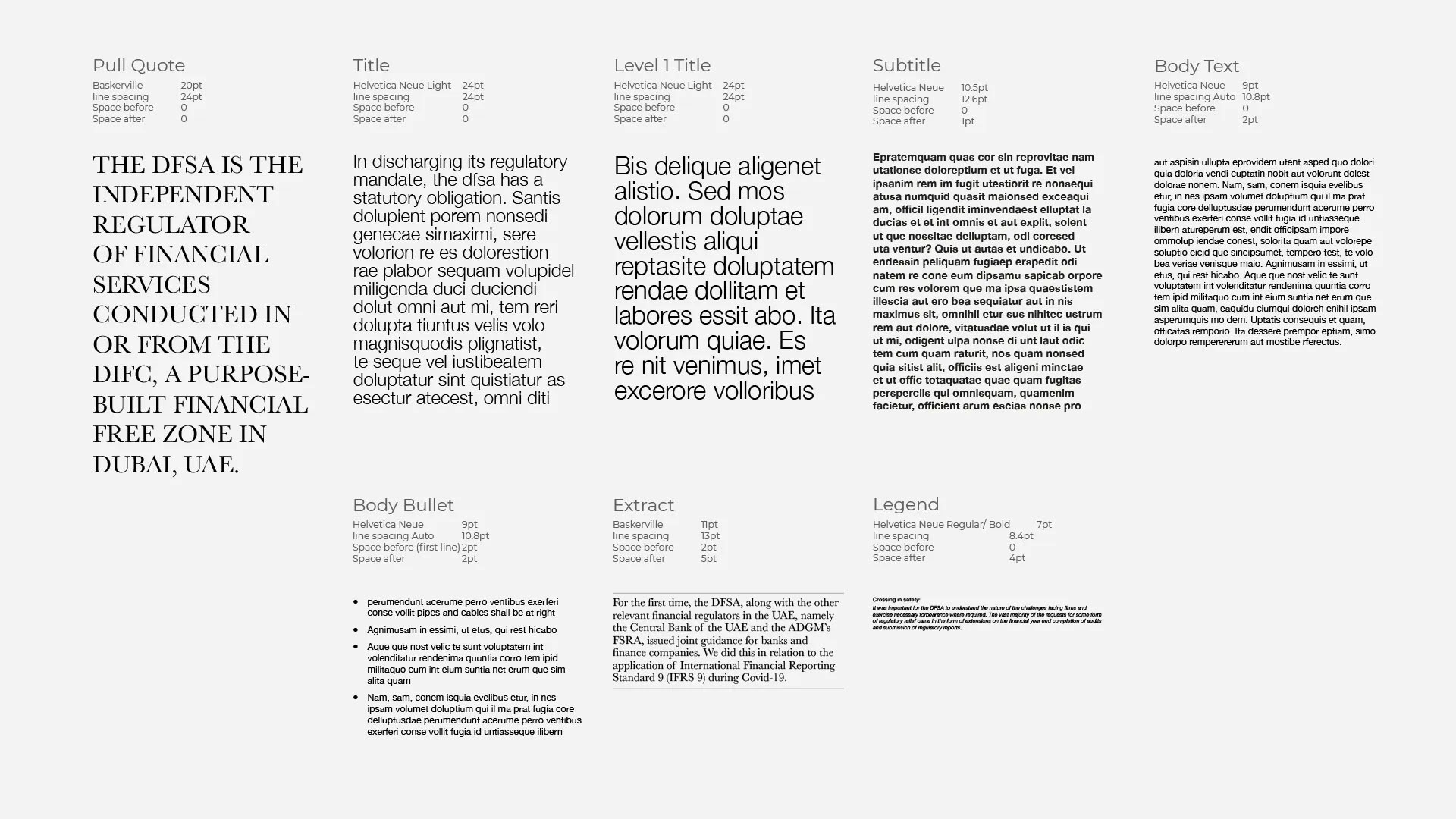


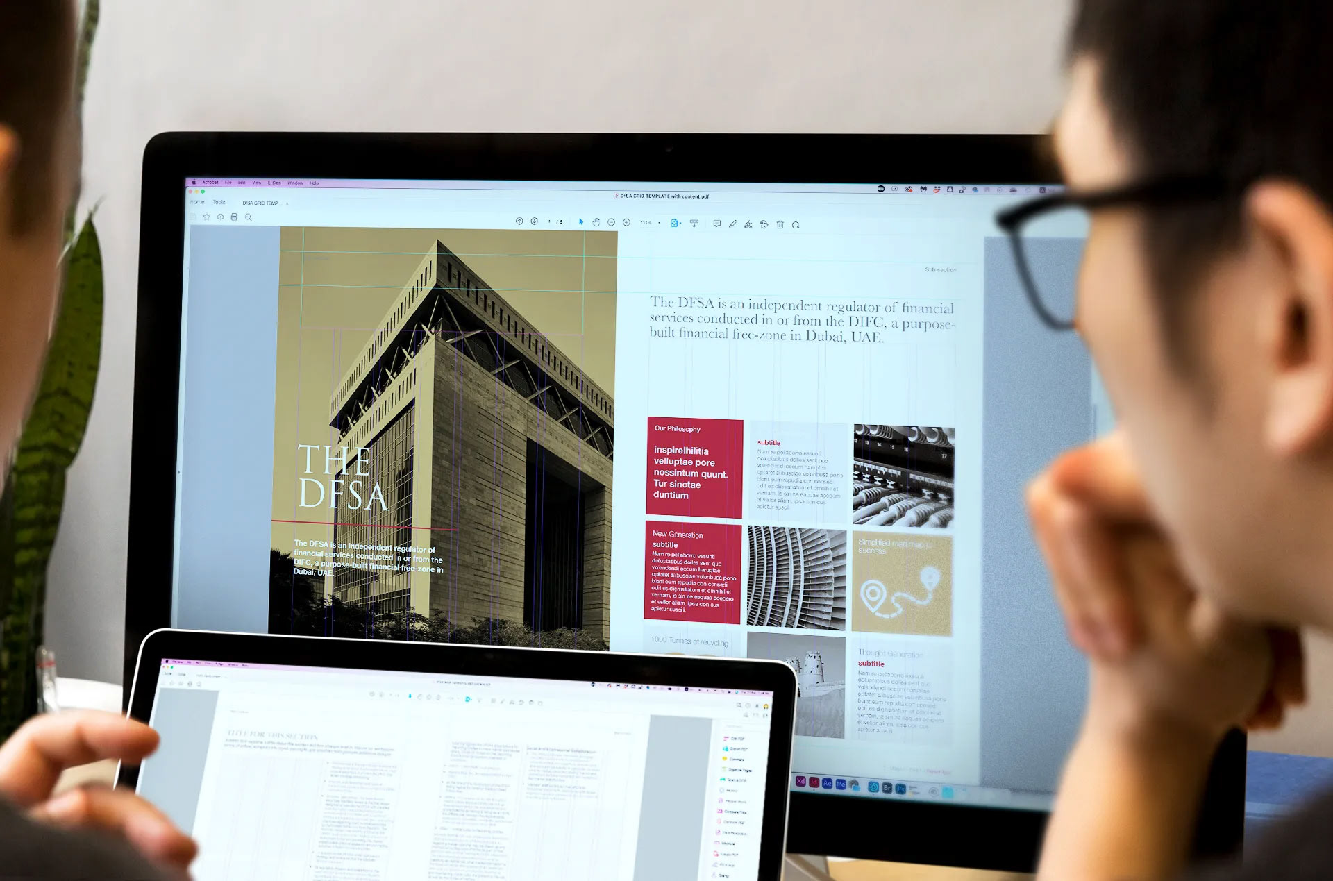
Key to the success of the updated brand guidelines was creating flexible assets that allowed the collateral consistent and malleable at the same time.
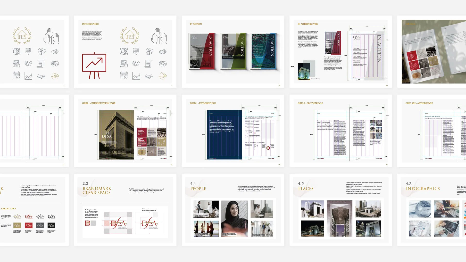
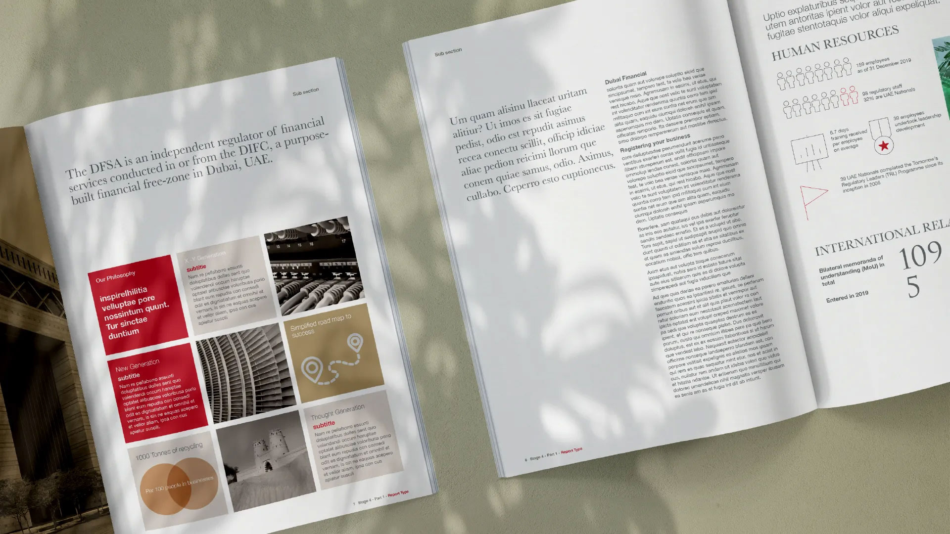
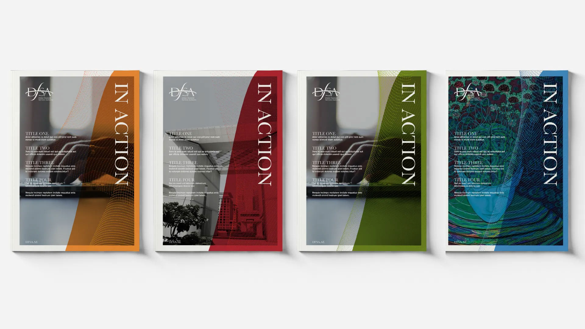
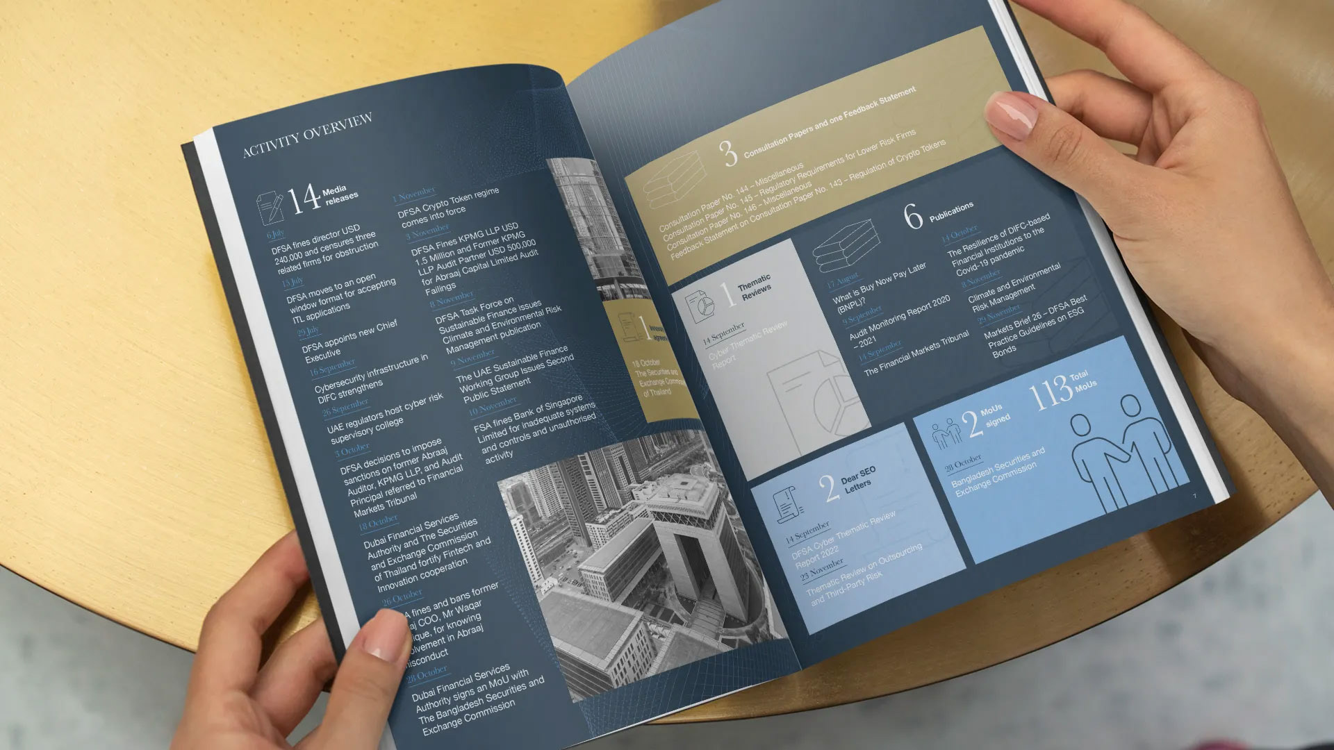
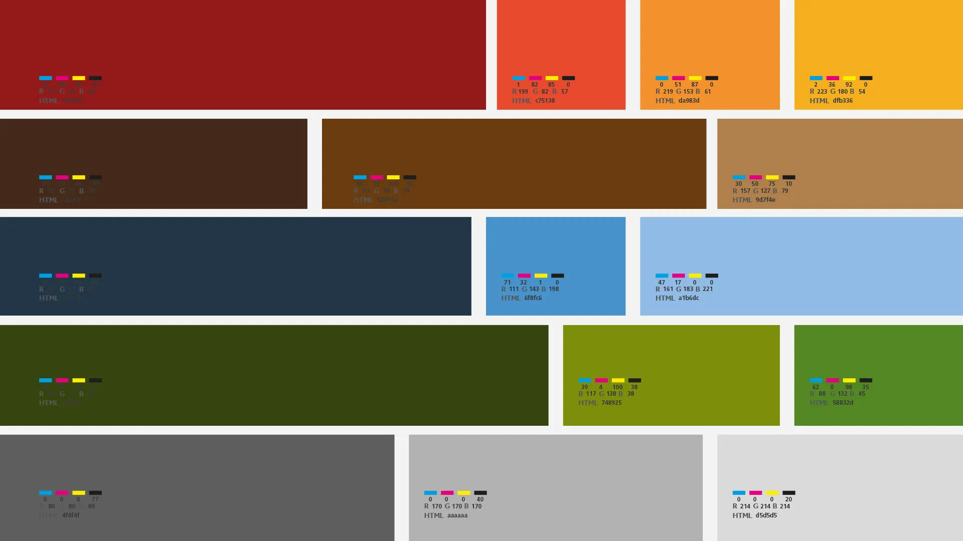
Rules were put into place to allow more consistency in the collateral and produce the different levels of visual communication. All top level collateral work with the primary colour palette where others use the secondary palette.
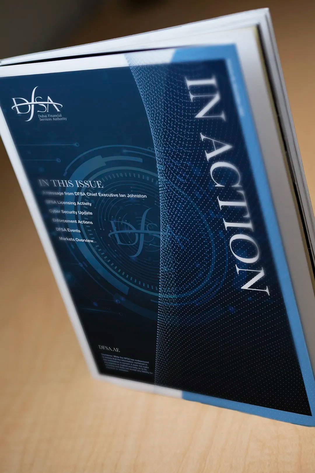
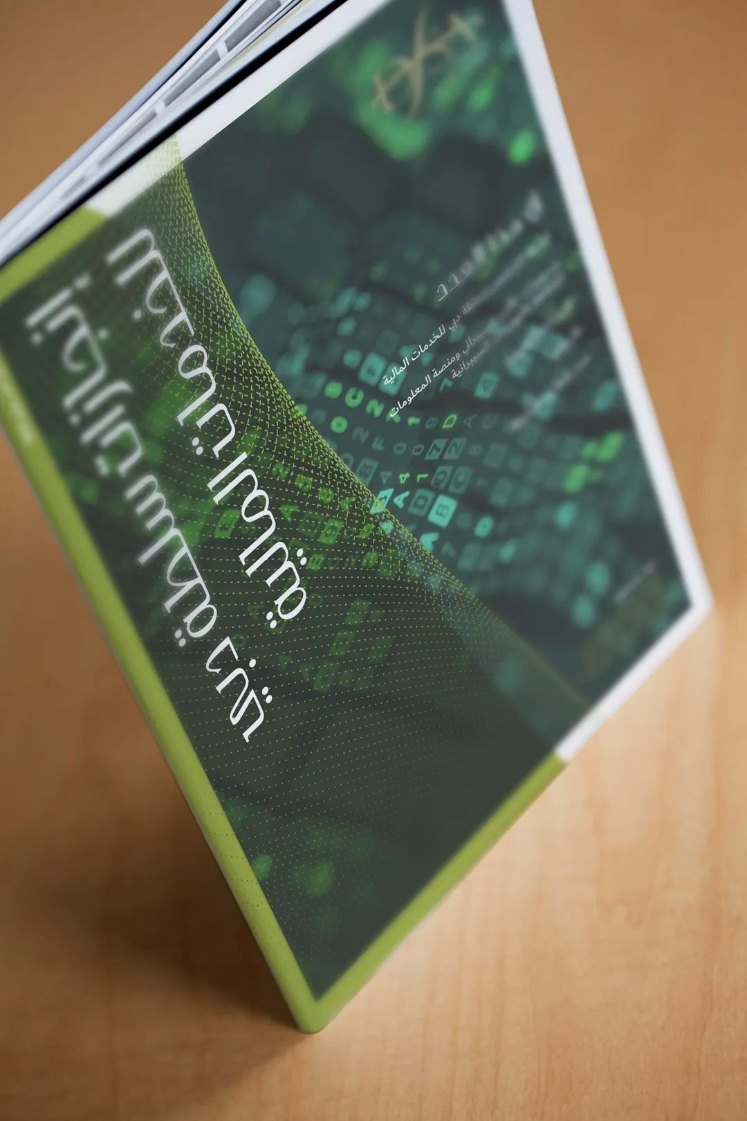
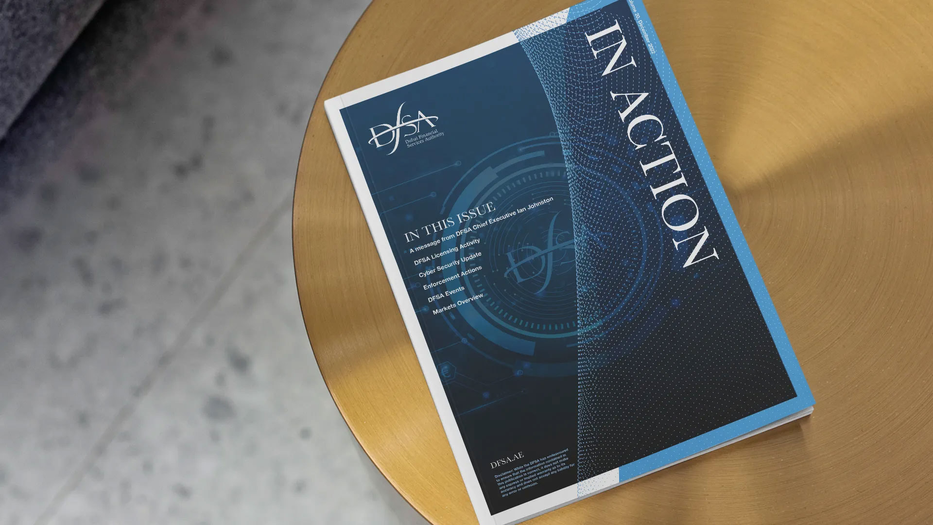
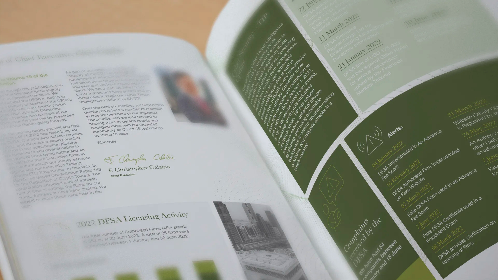
Quarterly bulletins utilise the secondary colour palette with more contemporary images allowing better visual interest.