
Battlefront Malta Visual Identity Revamp
Battlefront Malta is a non-government organisation based in Malta comprised of World War II collectors, researchers, and reenactors. With a mission to provide a comprehensive and multi-disciplinary perspective on the second world war, their team is dedicated to educating and engaging the public through organised events and exhibitions to explore both tangible and intangible heritage from the conflict.
The Goal
The goal of the Battlefront rebrand is to refresh its visual identity, appealing to a wide audience with an interest in military history. Despite its origins as a reenactment group that began 15 years ago, Battlefront aims to capture the essence of military history through its new brand aesthetic. By revitalizing the logo and overall design, the brand seeks to evoke a sense of authenticity and fascination associated with historical military campaigns. The rebranding effort aims to establish a strong and enduring connection with enthusiasts, collectors, researchers, and those passionate about military history, while expanding its appeal beyond its existing fan base. Through this strategic rebrand, Battlefront aims to create a visually captivating experience that resonates with a diverse range of individuals who share an interest in the captivating world of military history.
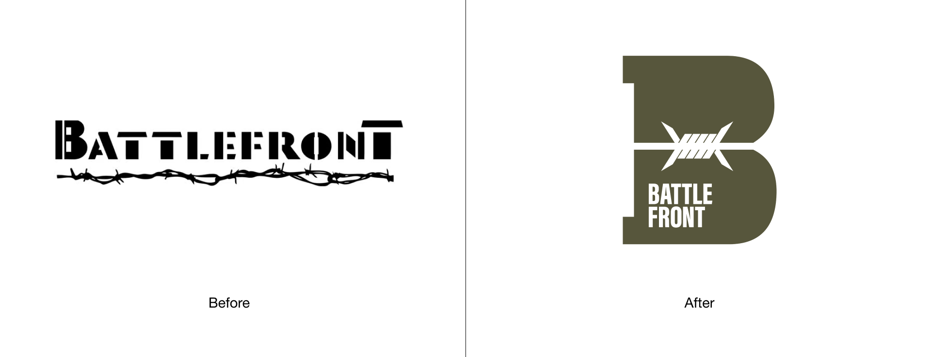
The Logo Pre-Rebrand
While the current logo effectively achieves simplicity and memorability, it undeniably exhibits signs of being outdated. The chosen typeface, with its uneven gaps in each letters, proves uncomfortable to read and compromises legibility. Similarly, the intricateness of the barbed wire element, though conceptually fitting, creates an excessive level of distraction.
To address these concerns, the redesigned logo presents a solution to the shortcomings of the current logo. By adopting a simpler approach and refining the typeface and barbed wire element, the new logos strike a better balance between modernization and preserving the original brand identity. This ensures improved readability, visual appeal, and a seamless transition for the Battlefront brand.
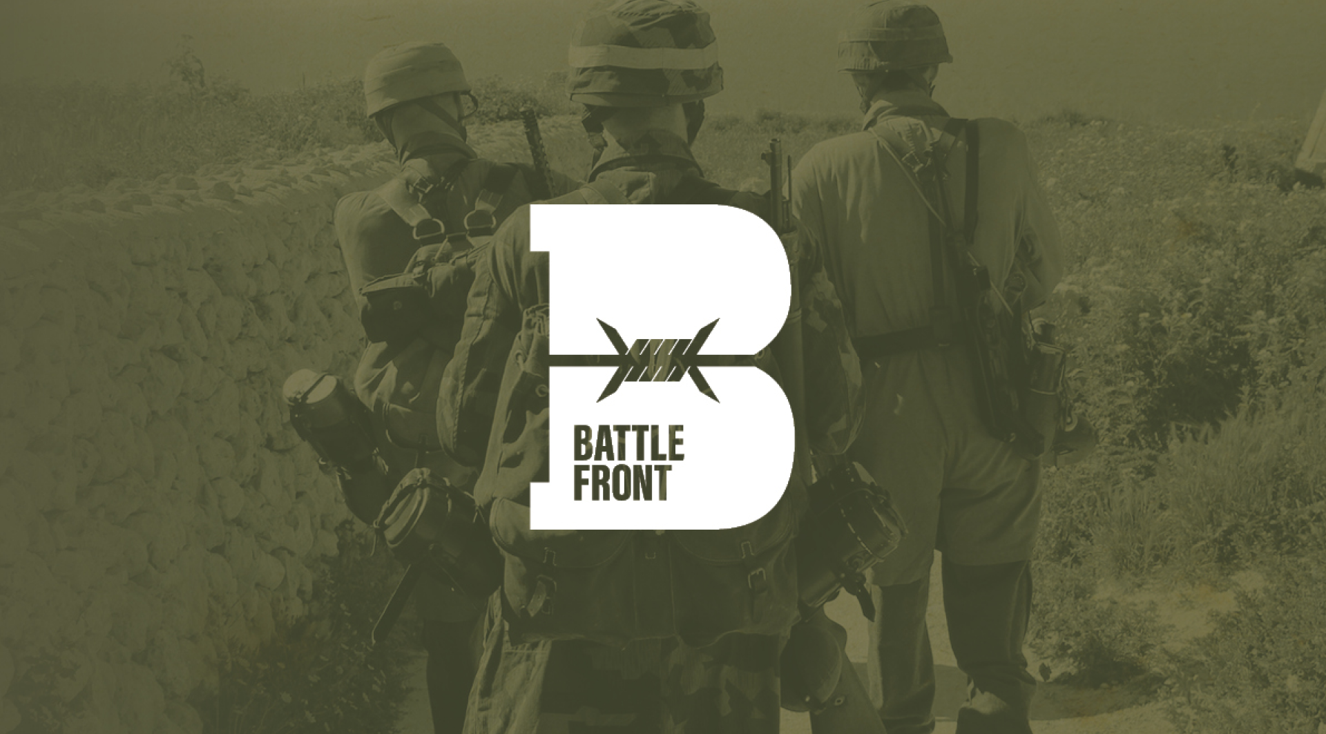
The Solution: A Modernised Battlefront
This logo concept embraces simplicity while honoring the current logo through the integration of a barbed wire silhouette. The symbol in this design cleverly incorporates the shape of the letter B, with the barbed wire silhouette artfully intersecting the symbol. This arrangement not only adds a visually engaging element but also enhances the recognizability of the letter B within the logo. The barbed wire serves as a nod to the brand’s identity, symbolizing strength, resilience, and the challenges faced in battle.
In summary, this concept excels in its simplicity while maintaining a clear connection to the current logo. The integration of the barbed wire silhouette within the shape of the letter B not only adds visual interest but also enhances the recognizability of the brand.
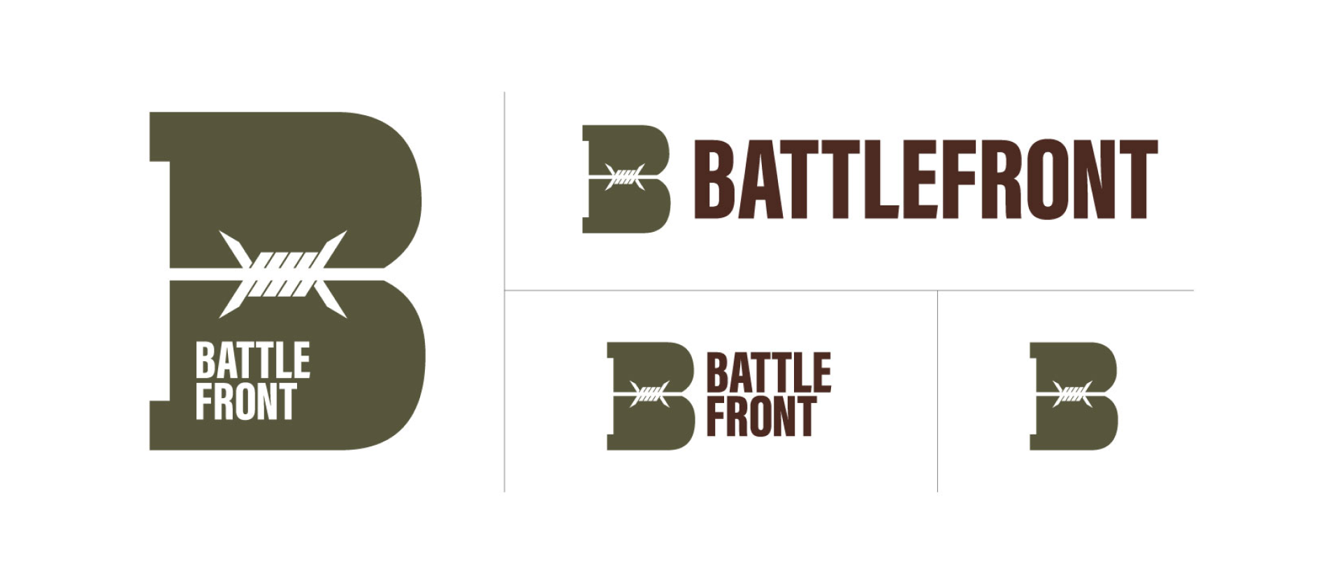
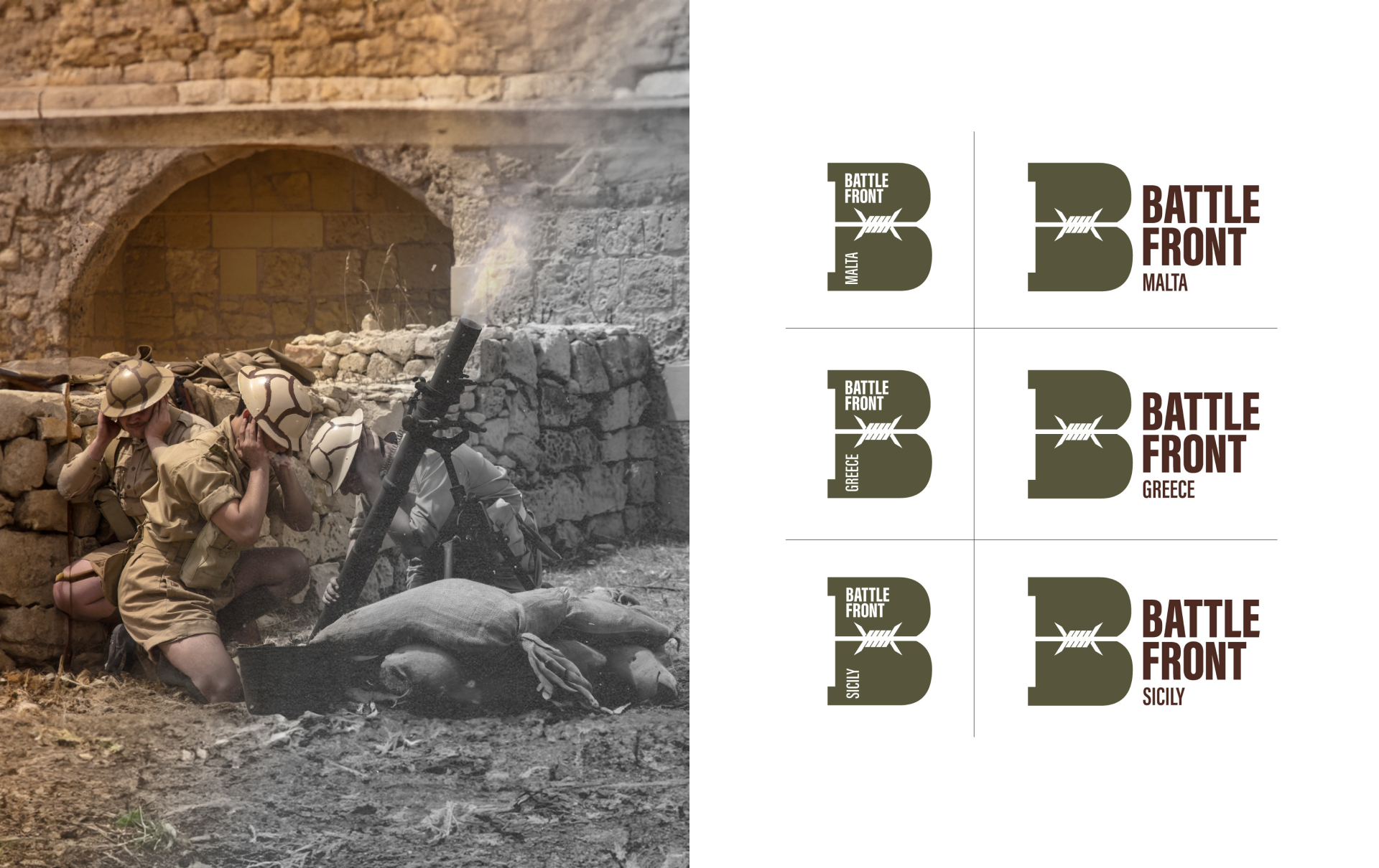
A Dynamic Identity and Localisation
This brand boasts a dynamic identity that allows for multiple versions of the logo without compromising brand recall. This adaptability ensures that the logo remains versatile across various applications and contexts, maintaining a consistent brand presence while accommodating diverse design requirements.
Additionally, since Battlefront operates in more than one country, the need for a location-specific logo may arise. With this in mind, the logo is designed so that it will be easy for the Battlefront team to add a specific location when needed.
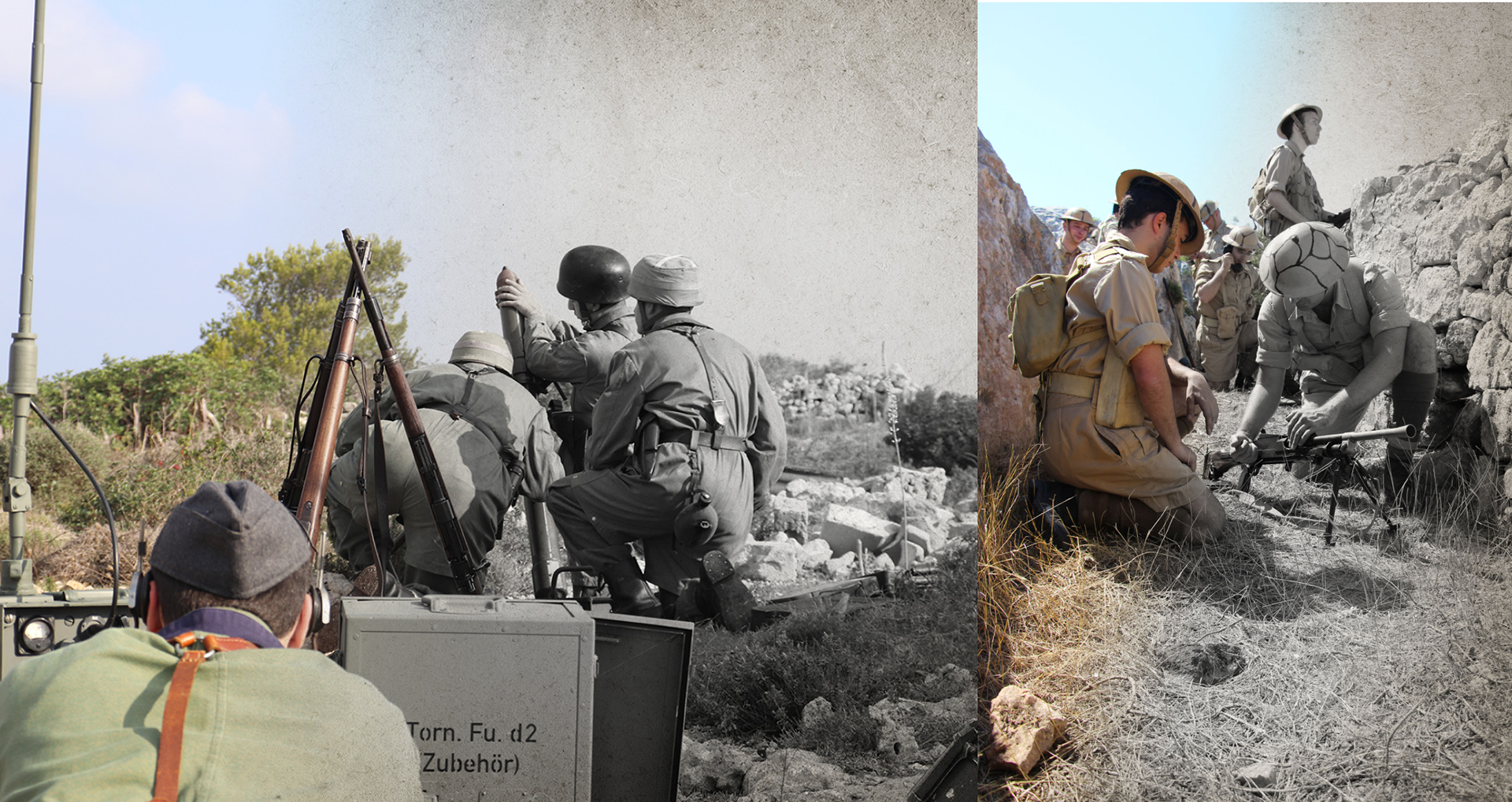
A Glimpse of the Past
For an artistic flair, photos are applied with a gradient effect that transitions from black and white to coloured. This adds a creative touch while visually emphasizing the reenactment aspect intrinsic to the brand’s identity.
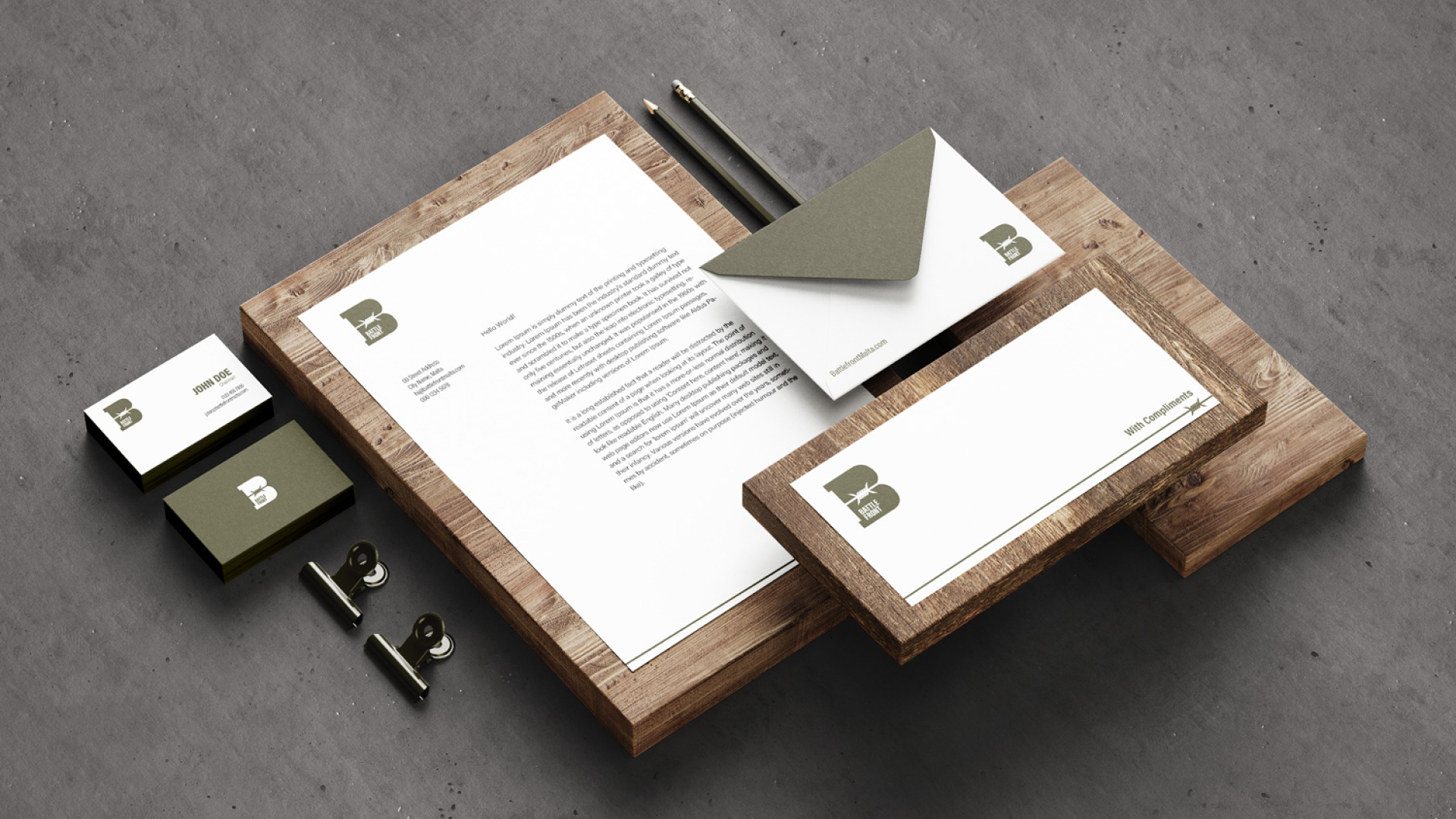
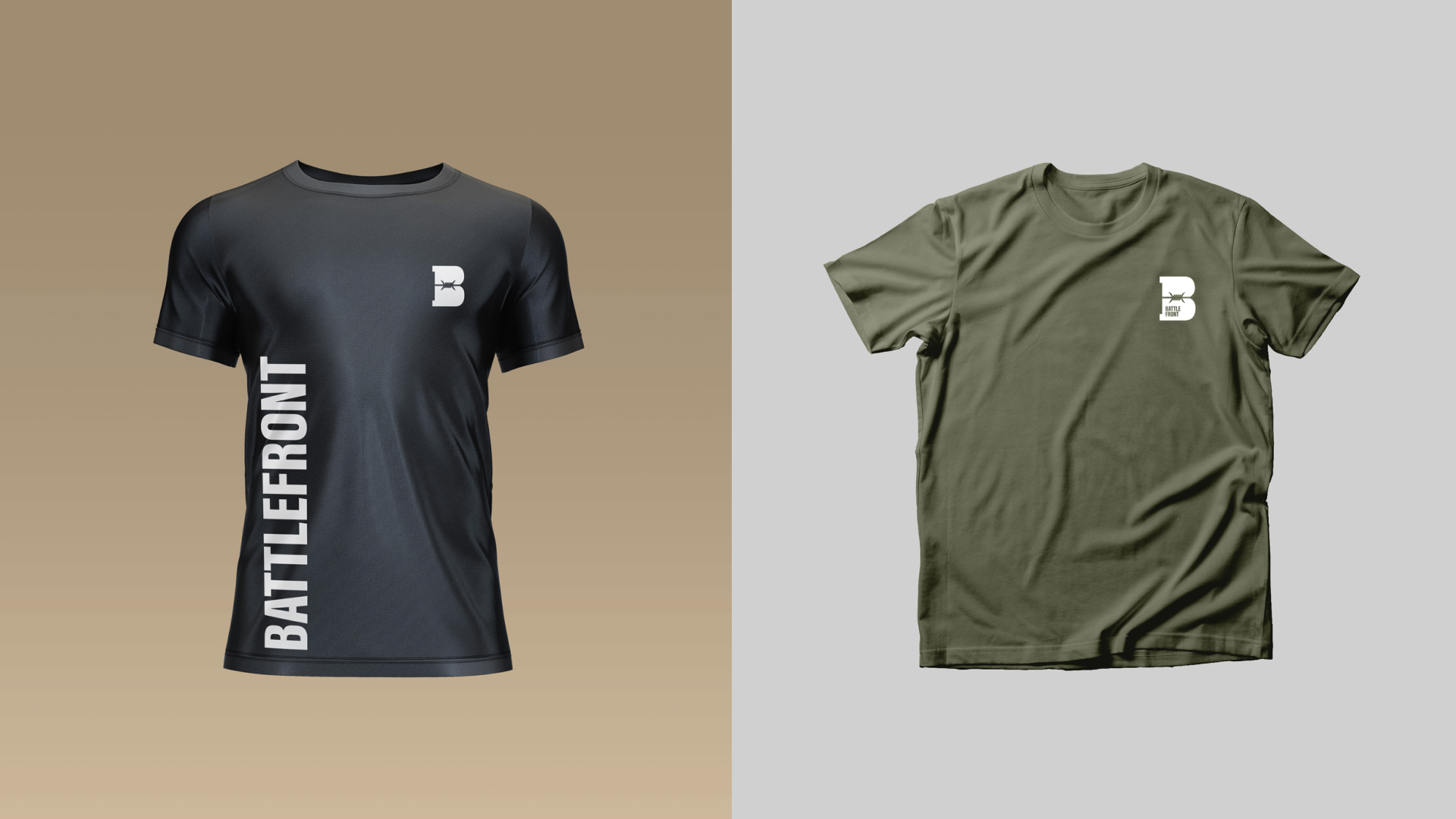
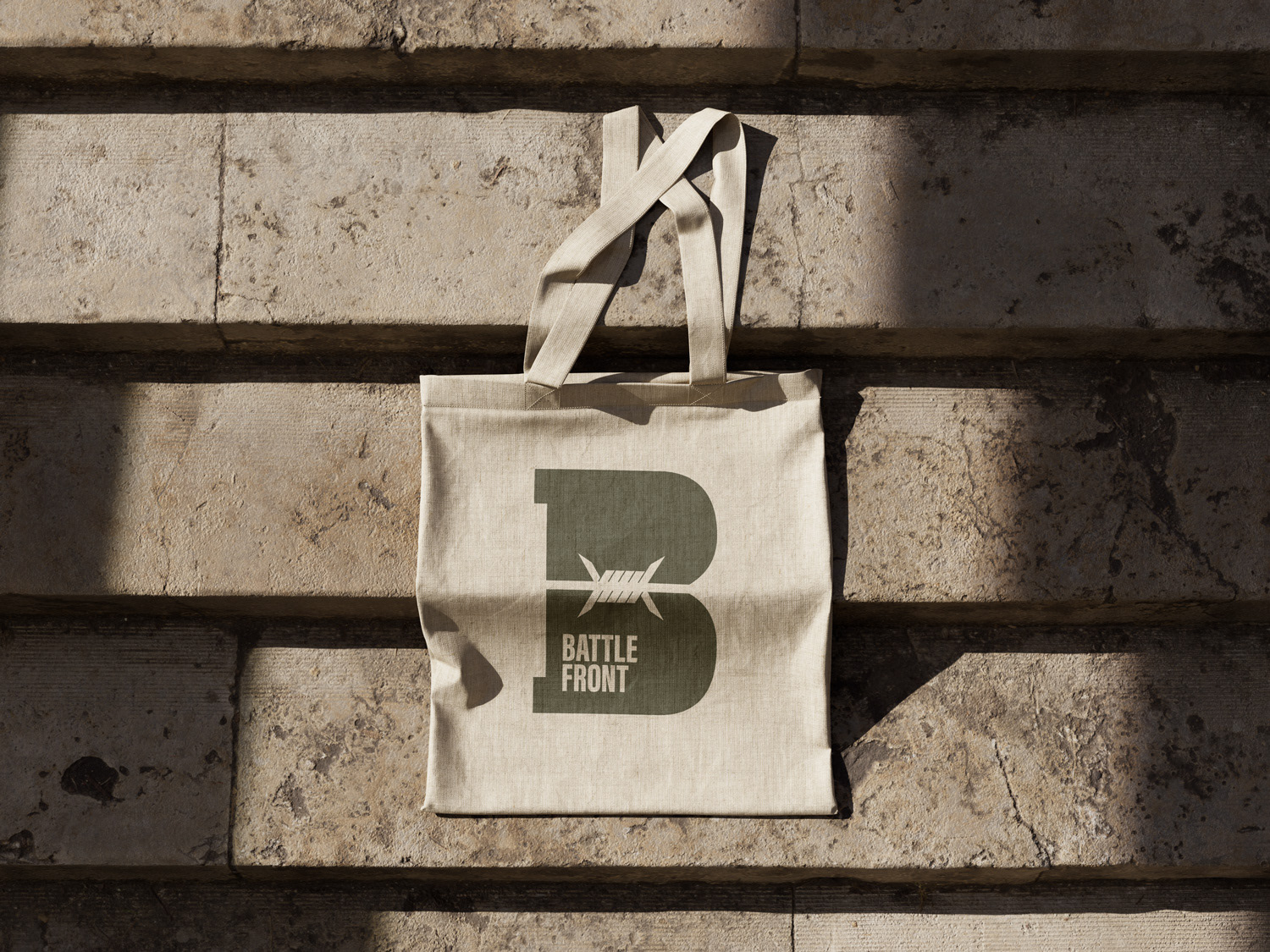
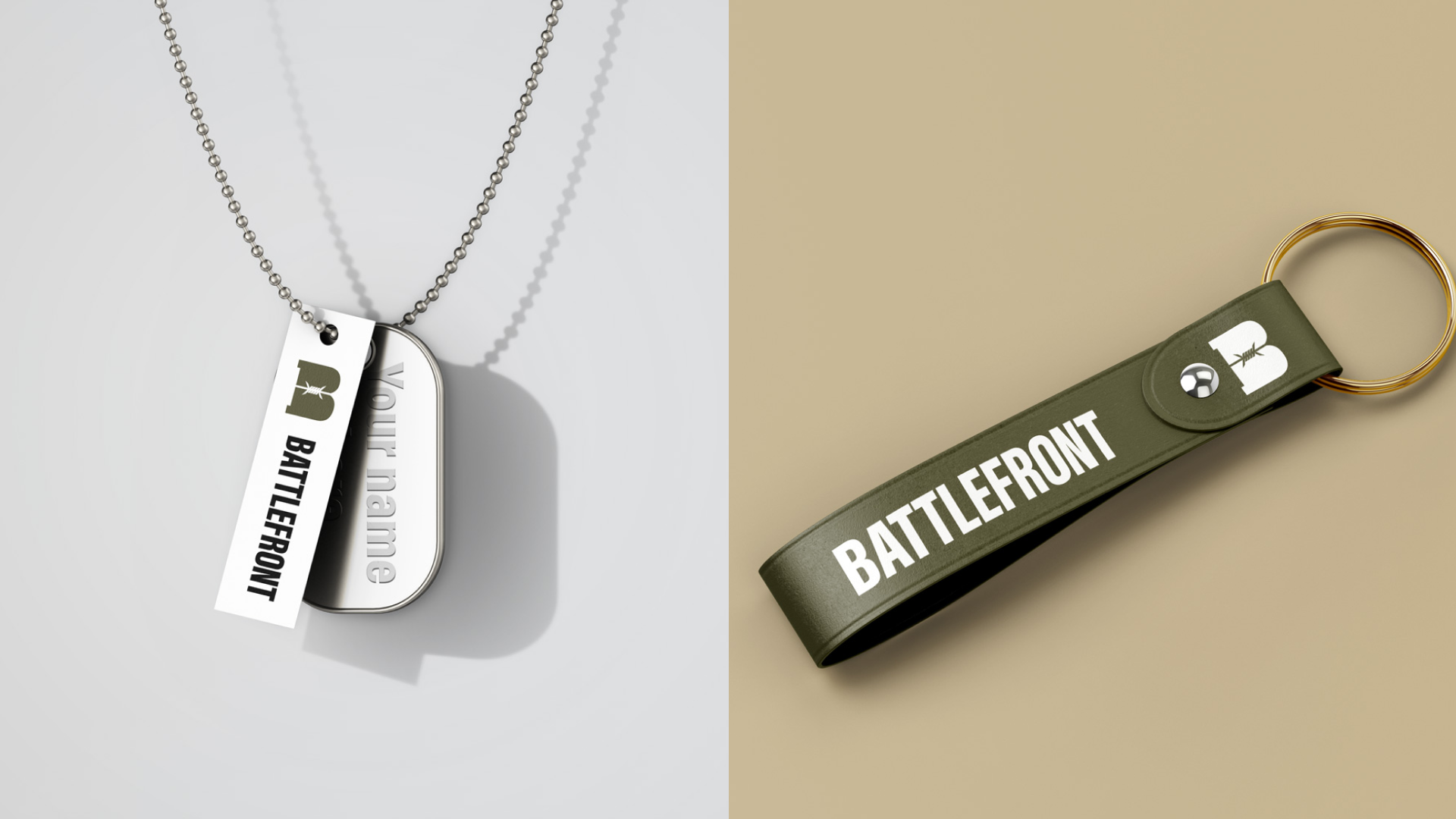
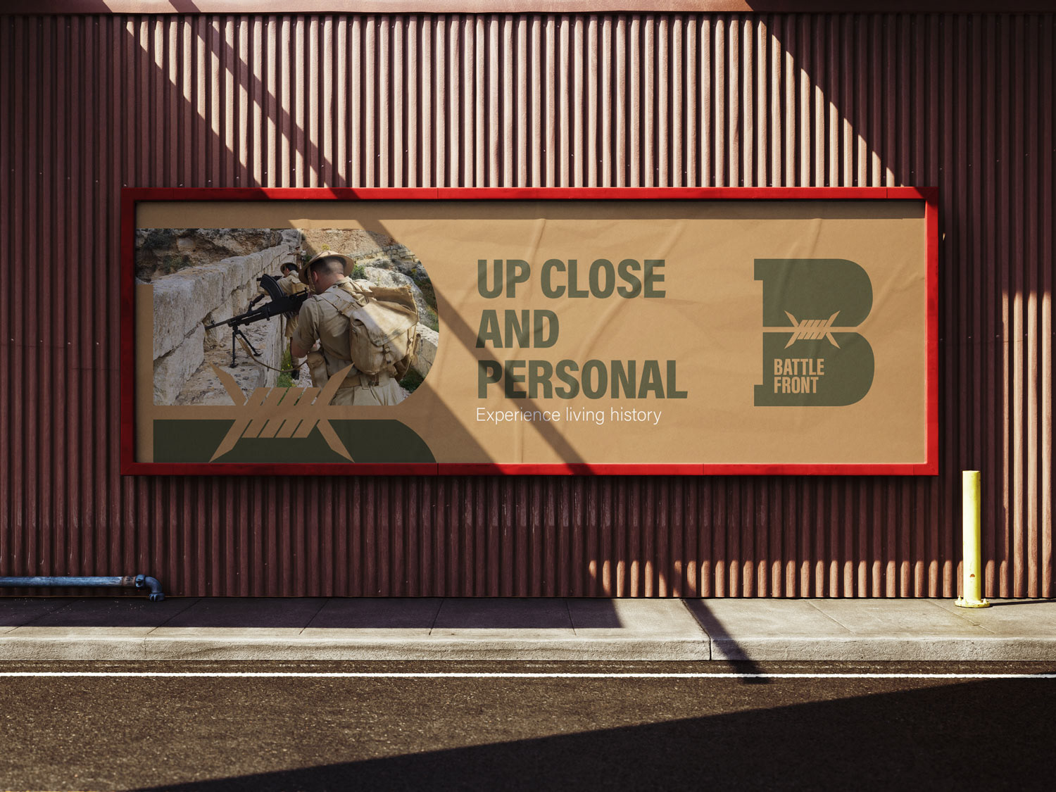
Up Close and Personal
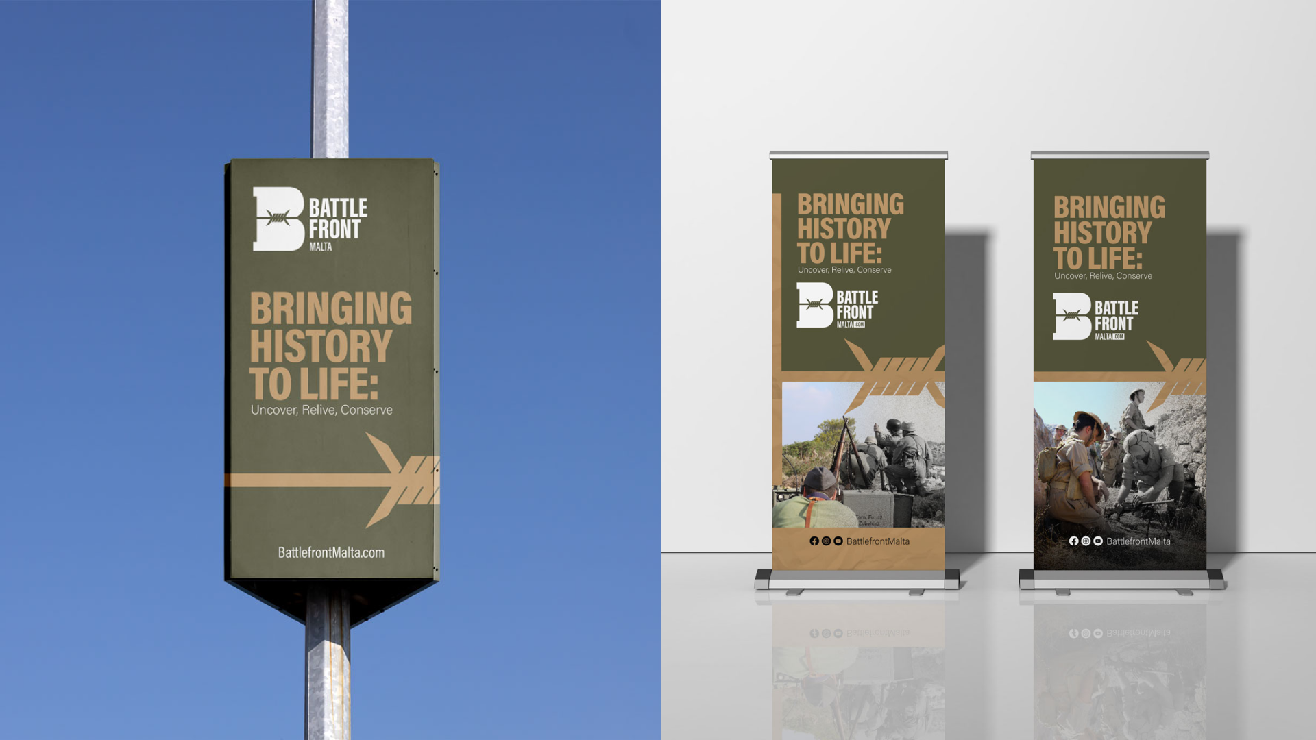
Each piece of communication material is carefully designed following the overarching identity of the Battlefront brand.


Thank you for checking out my work!
Battlefront Malta
https://battlefrontmalta.com
Contact me at deguzmanarnold.e@gmail.com